-
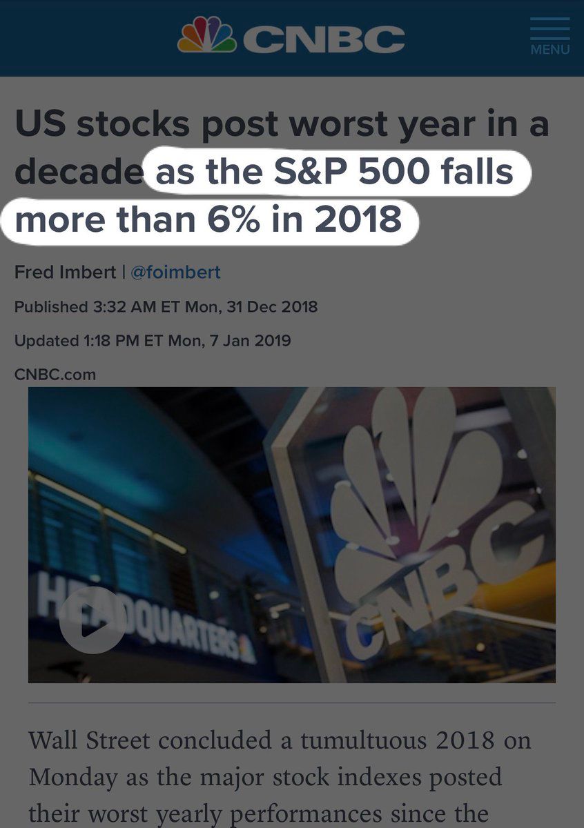
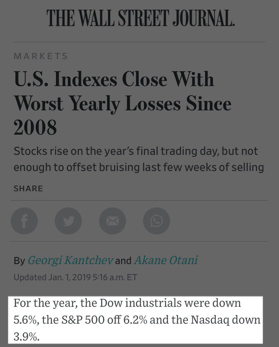
1/5. So here are a few news articles about the S&P 500’s performance last year. And some slides from my undergrad Principles of Finance class. Pop quiz: What was the rate of return on S&P 500 stocks in 2018? WRONG ANSWER: –6.2%. Because dividends.On twitter.com
 ♻️ 10 Retweets
❤️ 29 Favorites
Mood -2 🙁
♻️ 10 Retweets
❤️ 29 Favorites
Mood -2 🙁
-
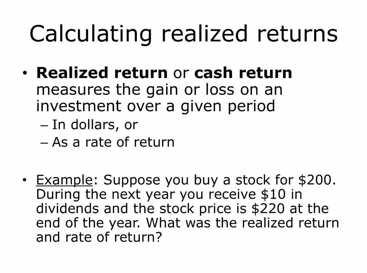
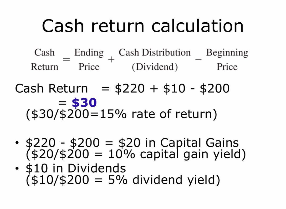
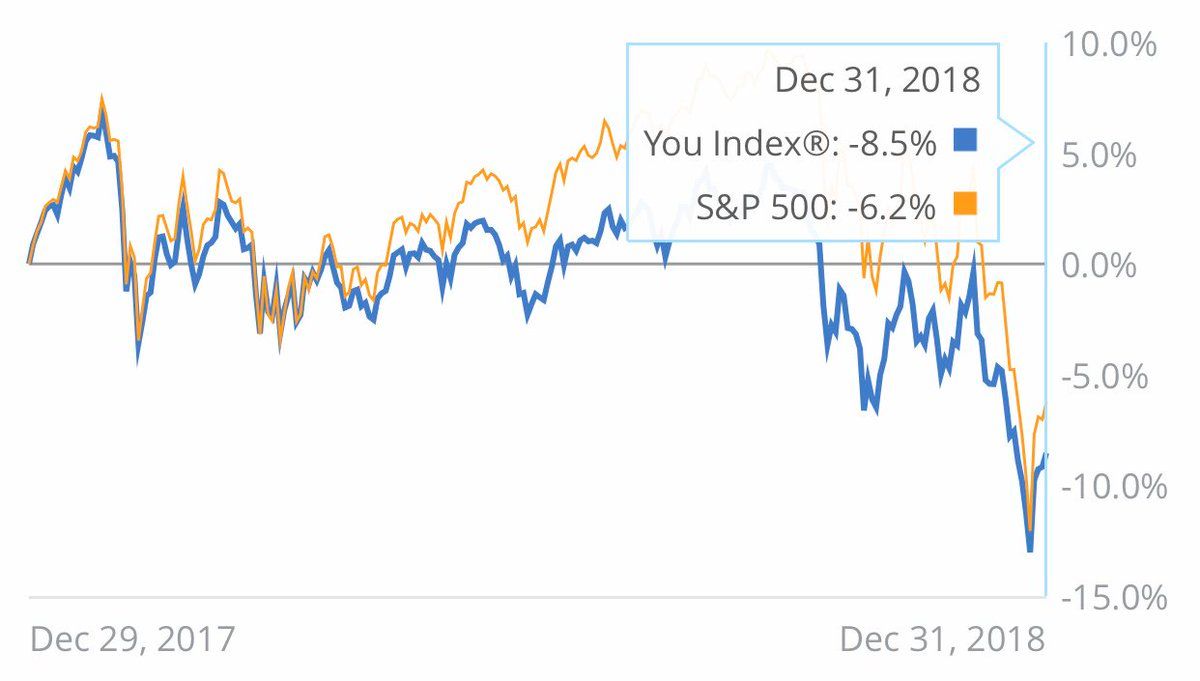
2. I use a cool portfolio visualization tool called @PersonalCapital to let me see what’s going on with my various investments and compares to benchmarks👇. Wait a second! Even though the S&P 500 *index* fell 6.2% last year, those stocks paid about 1.8% in dividends. R≈-4.4%!Permalink On twitter.com
 ♻️ 4 Retweets
❤️ 4 Favorites
Mood +1 🙂
♻️ 4 Retweets
❤️ 4 Favorites
Mood +1 🙂
-
3. I started to worry that @PersonalCapital was benchmarking *returns* against a *price change*. You can imagine why an advisor¹ might want to set themselves up for an unfair fight by ignoring stocks’ ~1.9% div yield. ¹I don’t use PC for advice, just viz. @lukestein/1112947221115232256Permalink On twitter.com
♻️ 4 Retweets
❤️ 2 Favorites
Mood -5 🙁
-
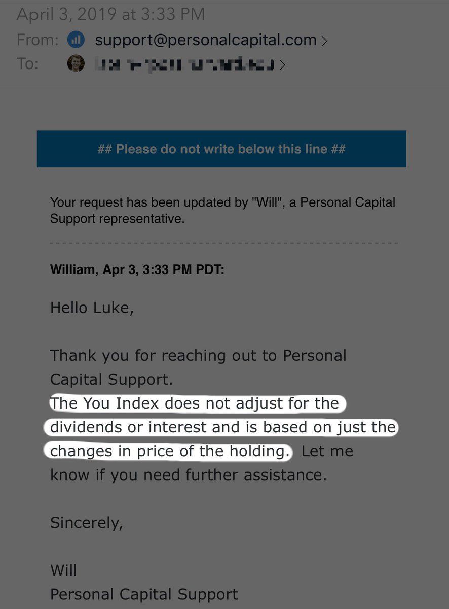
4. But the story has a happy (?) ending: @PersonalCapital apparently *also ignores dividends in calculating MY performance* 🤦♂️ Comparing this to SPX is a (rotten) apples-to-(rotten) apples comparison. And PC is implicitly penalizing premium bonds and high-DY stocks.Permalink On twitter.com
 ♻️ 4 Retweets
❤️ 9 Favorites
Mood -6 🙁
♻️ 4 Retweets
❤️ 9 Favorites
Mood -6 🙁
-
5/5. It’s not always easy to get finance right. (Even personal finance. Especially personal finance?) It’s not easy to get UX right. But as a producer or consumer of personal finance data, you should know what your data is, and think about the pitfalls of misinterpretation.Permalink On twitter.com
♻️ 4 Retweets
❤️ 13 Favorites
Mood 0
-
Return ≠ price change bonus tweet, now with ∞% more animated gifs!Permalink On twitter.com
♻️ 4 Retweets
❤️ 3 Favorites
Mood 0
-
Arithmetic average ≥ geometric average, animated gif editionPermalink On twitter.com
♻️ 4 Retweets
❤️ 2 Favorites
Mood 0